Colleges
- American Athletic
- Atlantic Coast
- Big 12
- Big East
- Big Ten
- Colonial
- Conference USA
- Independents (FBS)
- Junior College
- Mountain West
- Northeast
- Pac-12
- Patriot League
- Pioneer League
- Southeastern
- Sun Belt
- Army
- Charlotte
- East Carolina
- Florida Atlantic
- Memphis
- Navy
- North Texas
- Rice
- South Florida
- Temple
- Tulane
- Tulsa
- UAB
- UTSA
- Boston College
- California
- Clemson
- Duke
- Florida State
- Georgia Tech
- Louisville
- Miami (FL)
- North Carolina
- North Carolina State
- Pittsburgh
- Southern Methodist
- Stanford
- Syracuse
- Virginia
- Virginia Tech
- Wake Forest
- Arizona
- Arizona State
- Baylor
- Brigham Young
- Cincinnati
- Colorado
- Houston
- Iowa State
- Kansas
- Kansas State
- Oklahoma State
- TCU
- Texas Tech
- UCF
- Utah
- West Virginia
- Illinois
- Indiana
- Iowa
- Maryland
- Michigan
- Michigan State
- Minnesota
- Nebraska
- Northwestern
- Ohio State
- Oregon
- Penn State
- Purdue
- Rutgers
- UCLA
- USC
- Washington
- Wisconsin
High Schools
- Illinois HS Sports
- Indiana HS Sports
- Iowa HS Sports
- Kansas HS Sports
- Michigan HS Sports
- Minnesota HS Sports
- Missouri HS Sports
- Nebraska HS Sports
- Oklahoma HS Sports
- Texas HS Hoops
- Texas HS Sports
- Wisconsin HS Sports
- Cincinnati HS Sports
- Delaware
- Maryland HS Sports
- New Jersey HS Hoops
- New Jersey HS Sports
- NYC HS Hoops
- Ohio HS Sports
- Pennsylvania HS Sports
- Virginia HS Sports
- West Virginia HS Sports
ADVERTISEMENT
You are using an out of date browser. It may not display this or other websites correctly.
You should upgrade or use an alternative browser.
You should upgrade or use an alternative browser.
SEZ update, August 2018
- Thread starter RBB89
- Start date
Inside the new athletes’ dining hall/gameday club area on the concourse level. There will be two rows of red chairback seats outside.


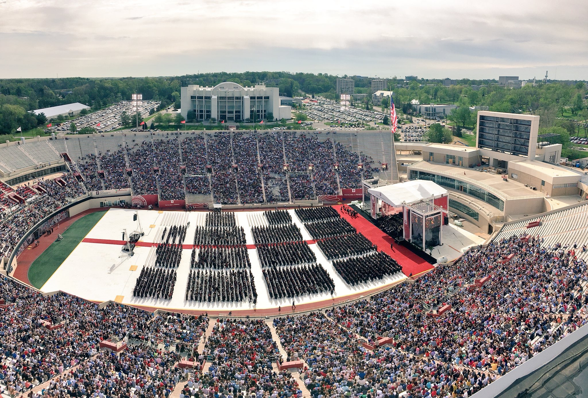
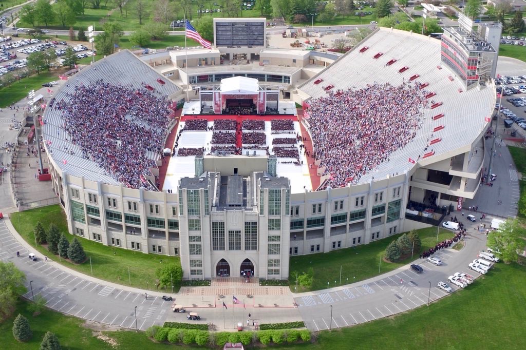
I was at that graduation ceremony on Saturday. The stadium looks GREAT! You cannot imagine how big that video screen is. The pictures do not do it justice.
Behind the ADA platforms. Grey stuff on the field is from graduation.
They removed a row behind each section.
They removed a row behind each section.
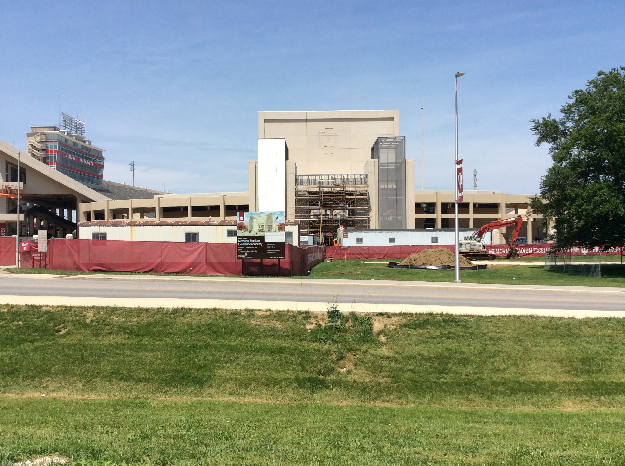
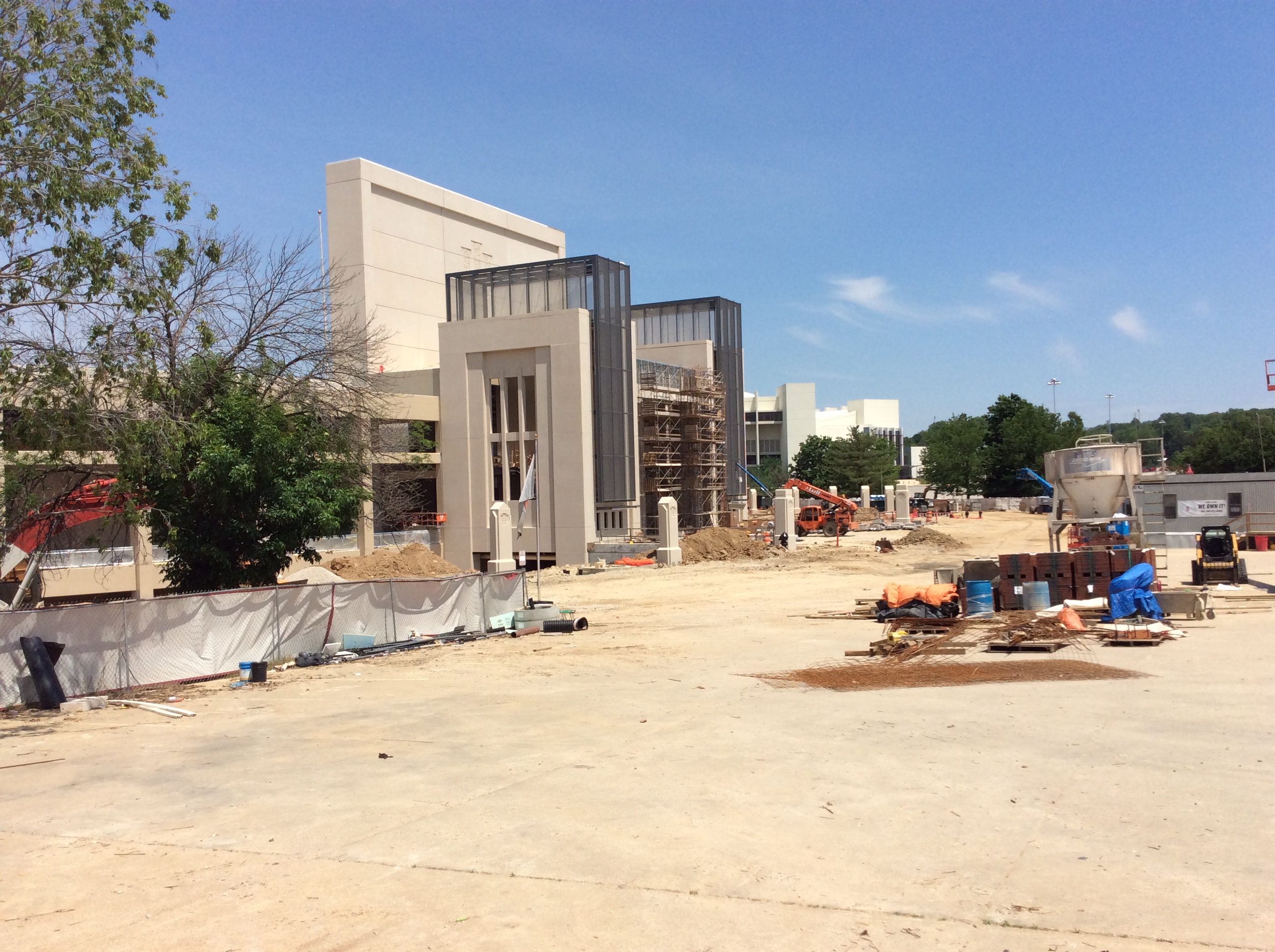
A couple nice shots from field level. In the top pic, the edge turf will be removed for matching reddish track, and there is a cutout for another door when the new locker room is finished. Note the newly painted concrete to match the existing stadium.

I am still torn over one issue.
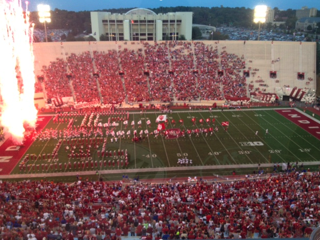
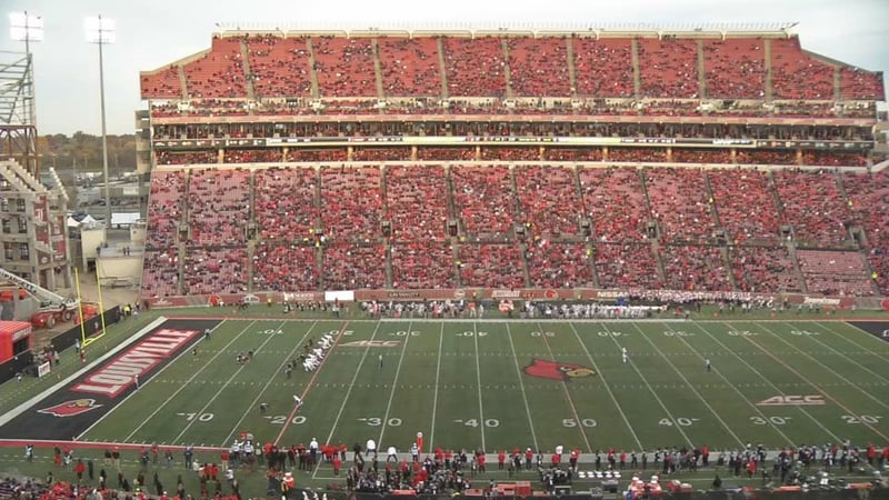
With our concrete-colored concrete stands, the stadium looks REALLY EMPTY any time there is no sell out. A BAD look on TV. A bad message. A ding to the "brand."
Here is a pic of a crowd that fills about half of the east stands at IU:
Here is a pic of a crowd at Louisville, also with about half the stands full, but a background of red seats:
Our game looks like "nobody there - nobody cares"
Theirs looks a lot less bad.
BUT, in my heart, I want our stadium FULL on game day so it doesn't matter what the color is behind the fans, and "candy striped" when empty - because THAT is the best IU brand around. Show ANYBODY ANYWHERE some candy-stripe warm ups and they KNOW - "that's IU." Imagine this with alternating crimson/white paint under the seats, i.e. "candy-striped Memorial Stadium":

Can't have everything.
I am still torn over one issue.
With our concrete-colored concrete stands, the stadium looks REALLY EMPTY any time there is no sell out. A BAD look on TV. A bad message. A ding to the "brand."
Here is a pic of a crowd that fills about half of the east stands at IU:

Here is a pic of a crowd at Louisville, also with about half the stands full, but a background of red seats:

Our game looks like "nobody there - nobody cares"
Theirs looks a lot less bad.
BUT, in my heart, I want our stadium FULL on game day so it doesn't matter what the color is behind the fans, and "candy striped" when empty - because THAT is the best IU brand around. Show ANYBODY ANYWHERE some candy-stripe warm ups and they KNOW - "that's IU." Imagine this with alternating crimson/white paint under the seats, i.e. "candy-striped Memorial Stadium":

Can't have everything.
Except if you painted every row under the seats you'e have horizontal stripes........now if you alternated sections you could get a vertical striped look......give me the paint, enough brushes, $100,000 and 1 year, and I'll get er done.
Except if you painted every row under the seats you'e have horizontal stripes........now if you alternated sections you could get a vertical striped look......give me the paint, enough brushes, $100,000 and 1 year, and I'll get er done.
That's why I'm torn.
If you paint it candy-striped, you still have half the stadium looking stark white empty.
I just think there’s several better uses of that type of money. They will power wash the stands/concrete late summer like they always do. Just fill em up.That's why I'm torn.
If you paint it candy-striped, you still have half the stadium looking stark white empty.
From the usual source:
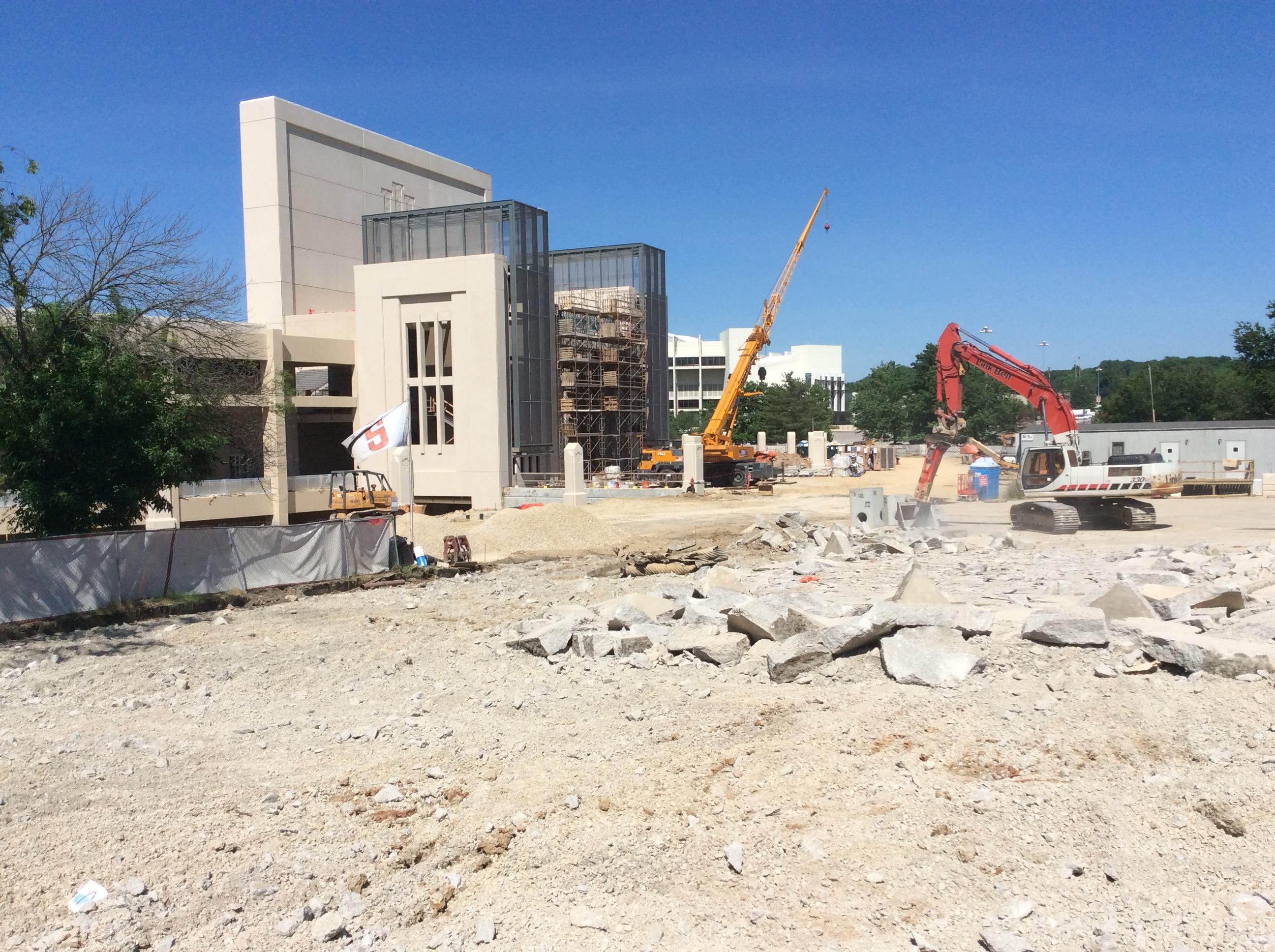
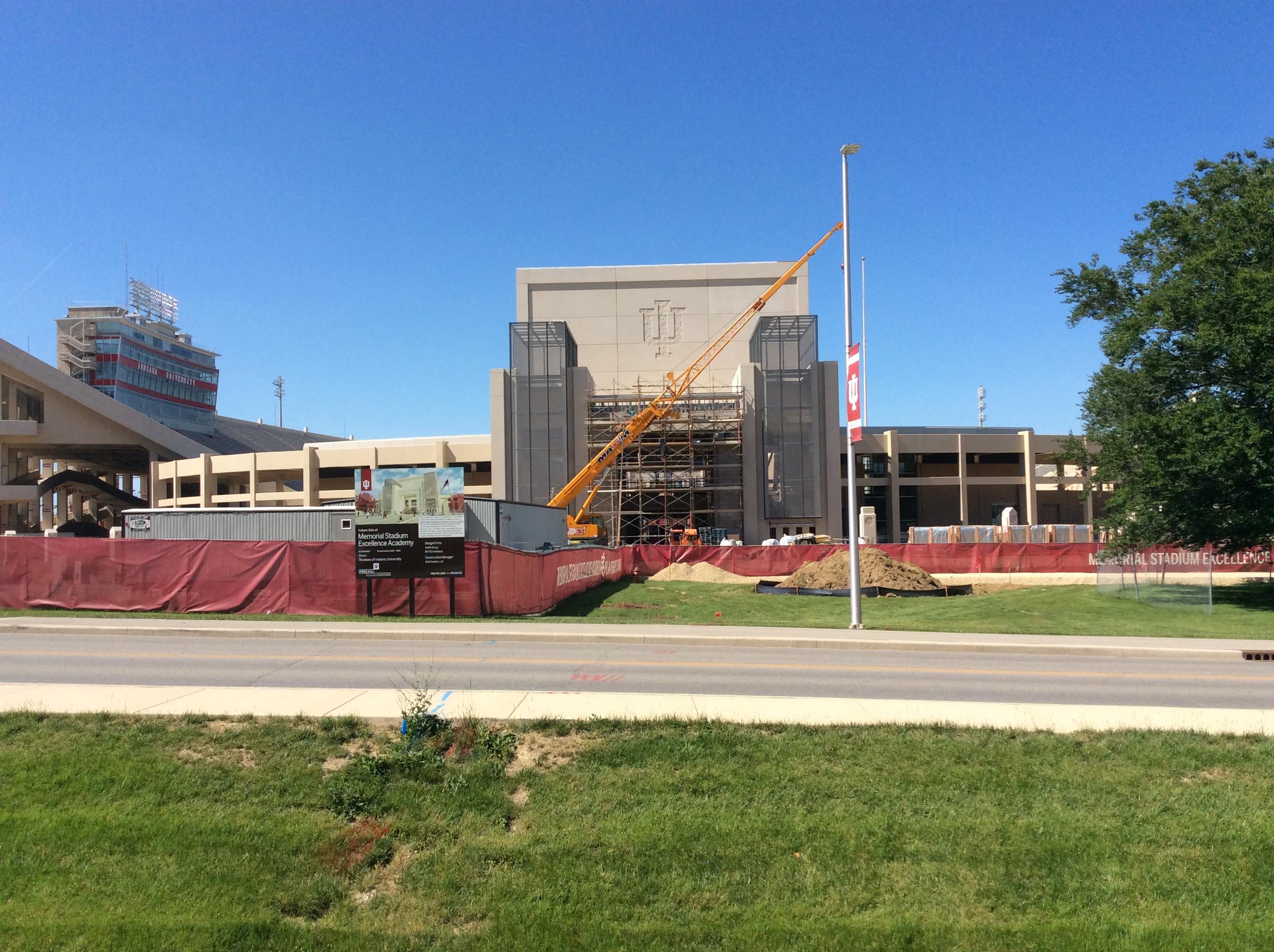
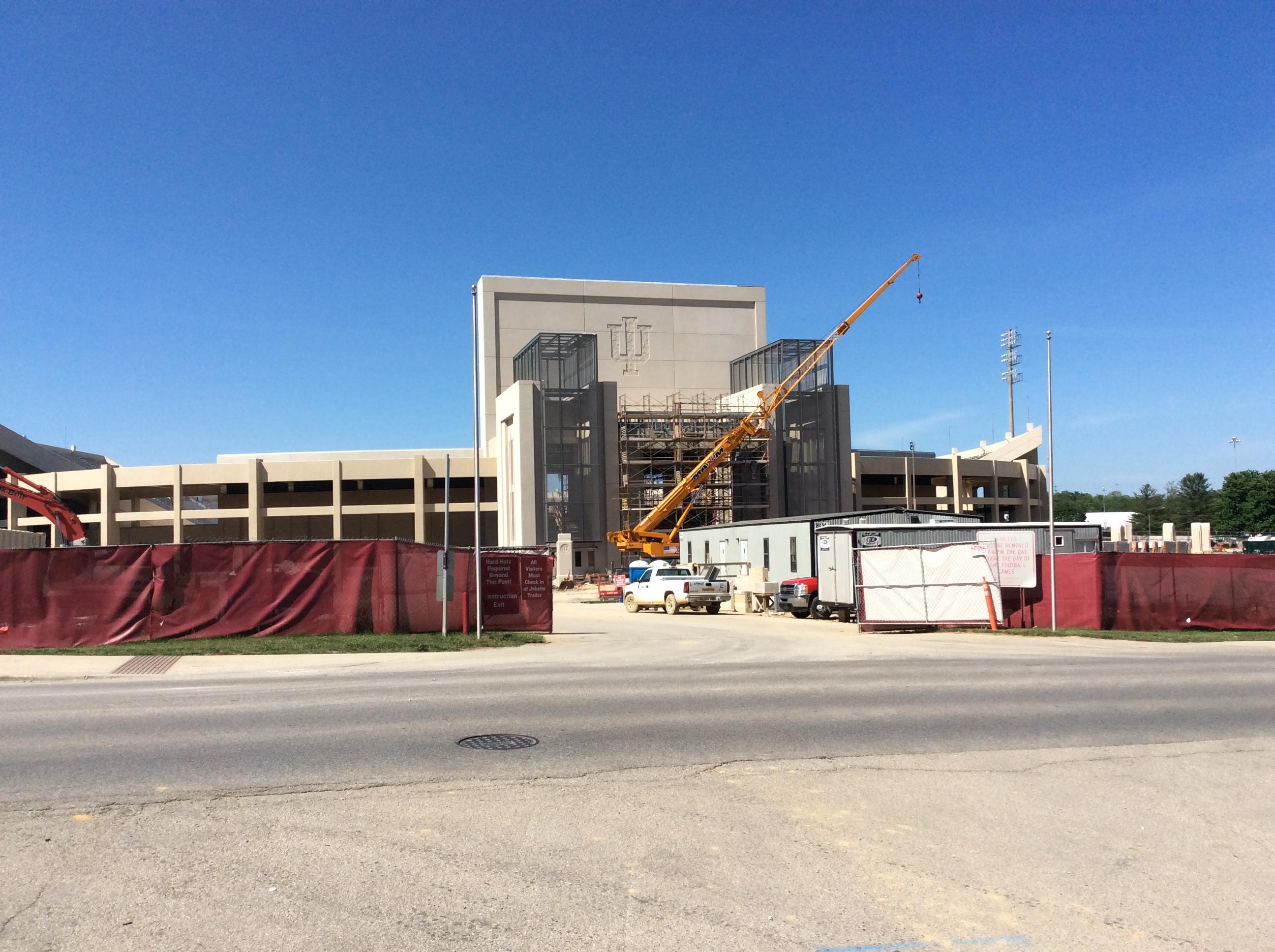
I'd like to see three limestone columns (5.5 ft sq at the base tapering to a point at the top) put up: - two in line with the windows on either side of the S Endzone bldg entry;
with a third centered on the entry and slightly forward of the other two (and not as high, say 5.5 foot vs 7 foot)..., and with Hep's Rock moved outside to be in line with the center 5.5 one...
Looking from above, if you drew a line connecting Hep's Rock with the three proposed limestone columns you'd see a diamond shape outline...
Hep's Rock would be closest and centered on the entry, where the players could still access it along with the public too (perhaps reroute "the Walk" to enter here[?])...
On the three columns the first would have something about John Pont and the "67" team + Rose Bowl, on the Right would be a 7 footer with Bill Mallory's bio +, on the left Bo McMillan's...
I'm also for formally naming the field for Bill Mallory while retaining the Stadium name.
I'd like to see the stadium "nickname" become "The Quarry" too while we're at it...
Hope some of this comes into being...
I've been to Papa Johns Cardinal Stadium. It's pretty nice. They have the red fold down seats. That is something we could do but that would take another large sum of money to get that done.
Pretty sure the videoboard is starting to go up, along with the red club seating going in soon based on the railing installation.
What they need to do is tear out those uncomfortable aluminum benches that can get either hot or cold depending on the weather and replace then with high impact plastic red seats. If they don't want to spend the money on seats (which they could) then replace them with the plastic benches in red.That's why I'm torn.
If you paint it candy-striped, you still have half the stadium looking stark white empty.
I've been to Papa Johns Cardinal Stadium. It's pretty nice. They have the red fold down seats. That is something we could do but that would take another large sum of money to get that done.
My consistent ding on the SEZ is that the lowered height and big spaces between the suites and the seats on the east and west sides makes the stadium look more disjointed than necessary. I was hoping they would build it at the same height as the east side. The extra space could have been used to replace some/all of our bleachers with red seat backs, making up for the loss in seats through seat additions in the SEZ.
If I understand correctly the football players will have a long walk from the locker room to the dining hall?Inside the new athletes’ dining hall/gameday club area on the concourse level. There will be two rows of red chairback seats outside.

It’s up one floor.If I understand correctly the football players will have a long walk from the locker room to the dining hall?
Ok I thought the locker room was going in same place as the old one.It’s up one floor.
For young athletes looking for food, that shouldn't be a problem.If I understand correctly the football players will have a long walk from the locker room to the dining hall?
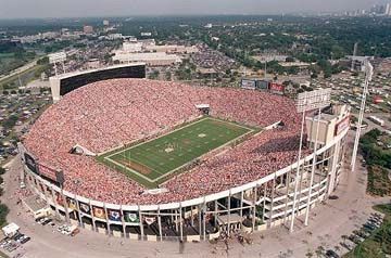
I was always a fan of the Sombrero Stadium - the old Tampa stadium You can adjoin lower sides by sloping the concrete:
The end zone gap on the SEZ for Memorial Stadium is a bit odd in that it doesn’t directly connect in to the stands, but I won’t argue that it it’s still a great addition. Kinnick stadium has the gap thing going on as well:
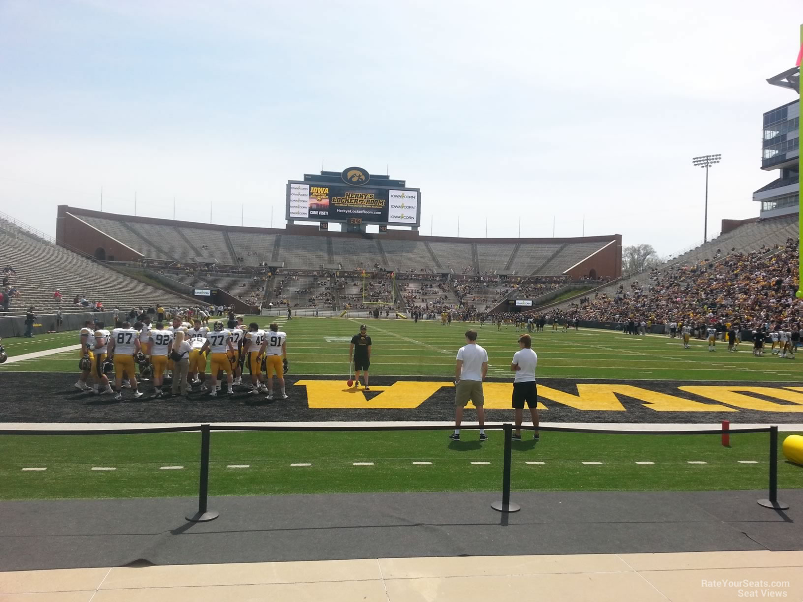

The end zone gap on the SEZ for Memorial Stadium is a bit odd in that it doesn’t directly connect in to the stands, but I won’t argue that it it’s still a great addition. Kinnick stadium has the gap thing going on as well:

It will be interesting to see what those gaps will mean to wind direction and intensity.
Our kickers could have a real home field advantage if they get that wind swirl figured out in October and November.
Our kickers could have a real home field advantage if they get that wind swirl figured out in October and November.
I would run lines with flags across the stadium at various heights on windy days and record the flag movements at various points as compared to the big flag. There may be some interesting wind patterns near the uprights and various ball flight positions. Sounds like a great student project.
Similar threads
- Replies
- 34
- Views
- 2K
- Replies
- 3
- Views
- 764
ADVERTISEMENT
ADVERTISEMENT


