

Colleges
- American Athletic
- Atlantic Coast
- Big 12
- Big East
- Big Ten
- Colonial
- Conference USA
- Independents (FBS)
- Junior College
- Mountain West
- Northeast
- Pac-12
- Patriot League
- Pioneer League
- Southeastern
- Sun Belt
- Army
- Charlotte
- East Carolina
- Florida Atlantic
- Memphis
- Navy
- North Texas
- Rice
- South Florida
- Temple
- Tulane
- Tulsa
- UAB
- UTSA
- Boston College
- California
- Clemson
- Duke
- Florida State
- Georgia Tech
- Louisville
- Miami (FL)
- North Carolina
- North Carolina State
- Pittsburgh
- Southern Methodist
- Stanford
- Syracuse
- Virginia
- Virginia Tech
- Wake Forest
- Arizona
- Arizona State
- Baylor
- Brigham Young
- Cincinnati
- Colorado
- Houston
- Iowa State
- Kansas
- Kansas State
- Oklahoma State
- TCU
- Texas Tech
- UCF
- Utah
- West Virginia
- Illinois
- Indiana
- Iowa
- Maryland
- Michigan
- Michigan State
- Minnesota
- Nebraska
- Northwestern
- Ohio State
- Oregon
- Penn State
- Purdue
- Rutgers
- UCLA
- USC
- Washington
- Wisconsin
High School
- Illinois HS Sports
- Indiana HS Sports
- Iowa HS Sports
- Kansas HS Sports
- Michigan HS Sports
- Minnesota HS Sports
- Missouri HS Sports
- Nebraska HS Sports
- Oklahoma HS Sports
- Texas HS Hoops
- Texas HS Sports
- Wisconsin HS Sports
- Cincinnati HS Sports
- Delaware
- Maryland HS Sports
- New Jersey HS Hoops
- New Jersey HS Sports
- NYC HS Hoops
- Ohio HS Sports
- Pennsylvania HS Sports
- Virginia HS Sports
- West Virginia HS Sports
ADVERTISEMENT
Install the app
How to install the app on iOS
Follow along with the video below to see how to install our site as a web app on your home screen.
Note: This feature may not be available in some browsers.
You are using an out of date browser. It may not display this or other websites correctly.
You should upgrade or use an alternative browser.
You should upgrade or use an alternative browser.
Like the meatier logos on the helmets. Is this new or have I not been paying attention?
- Thread starter All4UIU
- Start date
I think it's the "Heritage Logo" from the 40s & 50s. They were supposed to have it with a camo military theme uniform for the UM game but the B1G put the kibosh on it because they said it wouldn't contrast enough with the Mich. unis.
It did look good...Even If I am in the Block "I" camp.
I'm a sucker for the white helmets with the Indiana flag "torch & stars." I know it's obscure to people that aren't familiar with the Indiana flag, but it looks cool.
I thought they were fine for a game, but I’ve always thought the interlocking logo from that era looked amateur and goofy. I would like to see them find a way to use a larger version of the current interlocking IU on the helmets. Since someone mentioned it, I never pass an opportunity to say that the block I logo is trash and should be buried forever. 😀
Winning changes everything. The uniforms and helmets are looking much better this season. We don't need no stinking gimmicks! ")
Block I looks like Illinois and looks outdated.
IU logo is Indiana University.
IU logo looks great on the helmets.
Block I disappeared on the Basketball court a long time ago. No reason to bring it back.
IU logo is Indiana University.
IU logo looks great on the helmets.
Block I disappeared on the Basketball court a long time ago. No reason to bring it back.
Kinda looks like the logos on the Bob Knight Era Ball unis.I think it's the "Heritage Logo" from the 40s & 50s. They were supposed to have it with a camo military theme uniform for the UM game but the B1G put the kibosh on it because they said it wouldn't contrast enough with the Mich. unis.
A winning era. Nothing wrong with that!Kinda looks like the logos on the Bob Knight Era Ball unis.
Actually, your opinion is trash and should be buried forever.I thought they were fine for a game, but I’ve always thought the interlocking logo from that era looked amateur and goofy. I would like to see them find a way to use a larger version of the current interlocking IU on the helmets. Since someone mentioned it, I never pass an opportunity to say that the block I logo is trash and should be buried forever. 😀
It is the logo that was on BK's uniform shorts.Kinda looks like the logos on the Bob Knight Era Ball unis.
It is the logo that was on BK's uniform shorts.
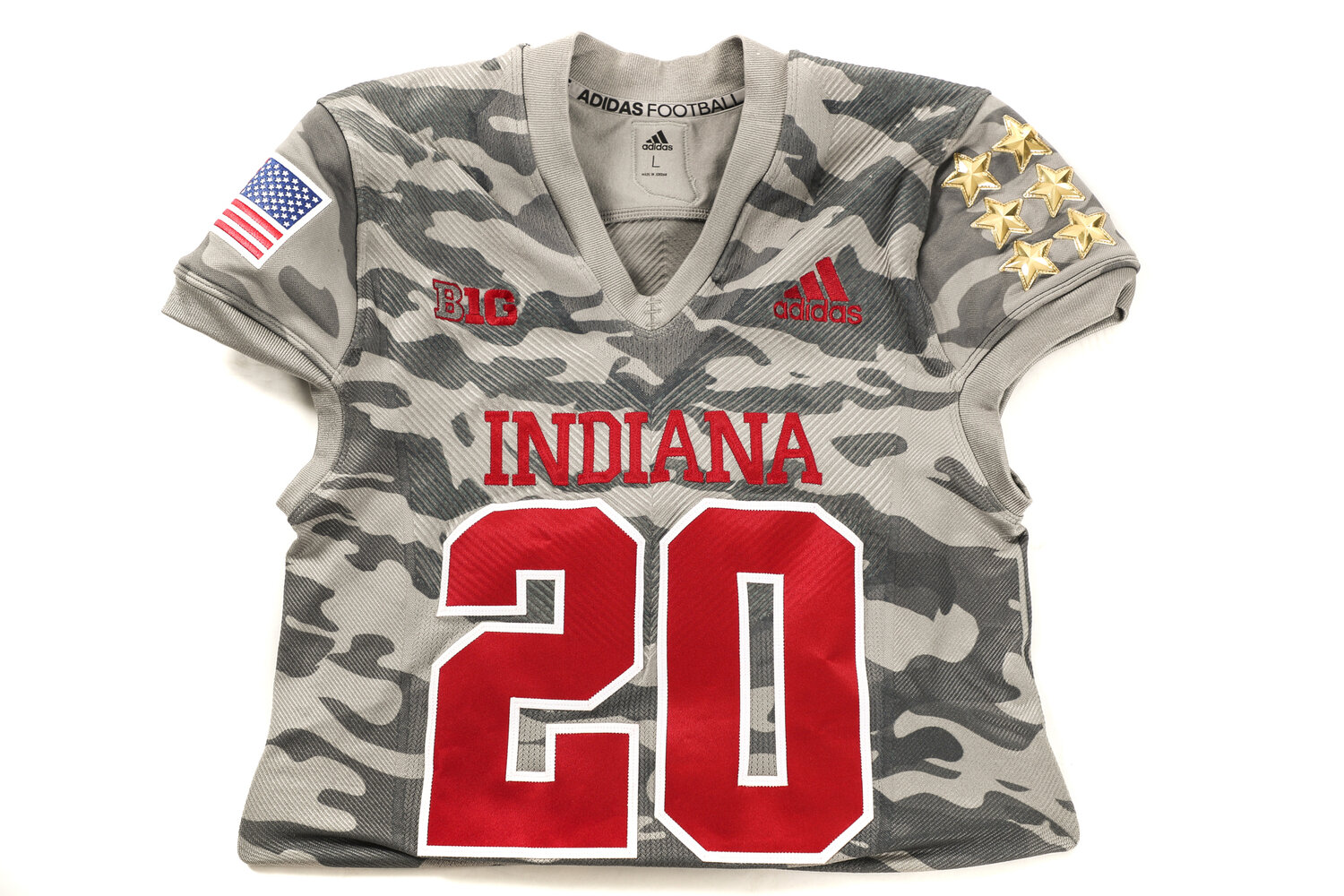
IU Gets Plug Pulled on Salute to Service Jerseys For Saturday's Game — Hoosier Huddle
Written by Sammy Jacobs (@Hoosier_Huddle) The Indiana Hoosiers were going to don camouflage uniforms on Saturday afternoon as their part of their ‘Salute to Service’ game. However, those plans were nixed after consulting the Big Ten.
 hoosierhuddle.com
Correct. It was university wide in the 30s through 50s, apparently, then RMK kept it on the BBall shorts.
I'm a sucker for the white helmets with the Indiana flag "torch & stars." I know it's obscure to people that aren't familiar with the Indiana flag, but it looks cool.
the Indiana flag is blue, and that state seal thing doesn't say IU imo.
in addition, the seal was only on one side, with IU on the other side of the helmet, so isn't symmetrical.
it also didn't have the racing stripe, and i do like having a non racing stripe alt helmet, but without the seal.
that said, while i hate all the white helmets, what i do really like about the red helmet version is the more traditional deeper richer red hue, and that it's gloss and not matte, so it's pretty much a more traditional IU look, except for the out of place logo on one side.
in short, i do really like that helmet, but absent the seal on one side, and with the interlock on both sides.
so great to be back to the traditional IU look now without all the crazy helmets.
only change i would do is lose the matte finish on the helmet, and go to a deeper more traditional red on the helmet that matches the jerseys, and doesn't have that orange huge like the current ones.
Last edited:
Personal preference...I like the salute to heritage but the logo looks forced and oversized for the real estate it has.
Personal preference...I like the salute to heritage but the logo looks forced and oversized for the real estate it has.
Ordinarily I'd agree but in this case it looks great on TV..., and...,after just a glance..., I'd say we really dodged a metaphorical bullet by not being allowed to wear that camo abomination...
Let's just leave the uni tinkering to the west coast waterfowl and stick with "what brung ya" here in INDIANA (and I'm as pro-military as anyone you're ever going to run into)..,.
If the league won't let them wear vs UM in all white, doubtful they will allow them at all.
@MSU? Nope, too much camo green
@OSU? Nope, too much red in numerals
MD? Nope, too much red
@ UW? Nope, too much red
PU? Maybe, but personally want us in Red for that one.
@MSU? Nope, too much camo green
@OSU? Nope, too much red in numerals
MD? Nope, too much red
@ UW? Nope, too much red
PU? Maybe, but personally want us in Red for that one.
The 2 stripes are too wide, at least proportionally with the trident. The heritage trident actually occupied it's real estate much less awkwardly than the modern trident thanks to increased visual weight. The modern trident looks like it's being gravitationally sucked upwards towards the nearest stripe. If there is an objective design element problem with the helmet, this is it.
So it's unfortunate that it's not the first thing off the tongues of people when it's time for helmet talk. I think Crimson Quarry wrote about this one time, but designers need to speak up. The block I creates a balanced helmet, but I'd rather honor the trident and find a way to make that work. I almost can't stand to look at the helmets as they are now, so I'm going to hope the heritage logo takes over for now--it's a good band-aid.
So it's unfortunate that it's not the first thing off the tongues of people when it's time for helmet talk. I think Crimson Quarry wrote about this one time, but designers need to speak up. The block I creates a balanced helmet, but I'd rather honor the trident and find a way to make that work. I almost can't stand to look at the helmets as they are now, so I'm going to hope the heritage logo takes over for now--it's a good band-aid.
Last edited:
Like the curved logo. Wished we never changed it. I wore a pair of IU shorts as a kid to the threads with that same logo on them.
I think I liked the Lynch era unis. Loved the stripes. Looked classic like the Colts.
Edit—Just looked up the Lynch unis. Pair them with regular double strip pants and take the stripe off the sides and it’s a winning combo.
I think I liked the Lynch era unis. Loved the stripes. Looked classic like the Colts.
Edit—Just looked up the Lynch unis. Pair them with regular double strip pants and take the stripe off the sides and it’s a winning combo.
Good discussion. Always thought coaches changing uniforms was a poor excuse for changing culture.
I don't care too much about uniforms but I am partial to traditional looks. Don't need fancy uniforms, we need good players, which we seem to have all the sudden.
Maybe if we continue to win our brand will solidify itself. Change the culture like CTA and nobody gives a shit what you wear. I hope we stay simple and traditional. I like the matte crimson helmets a lot. Go Hoosiers!
I'm a sucker for the white helmets with the Indiana flag "torch & stars." I know it's obscure to people that aren't familiar with the Indiana flag, but it looks cool.
I'm with you 100% on the state flag torch & stars logo! That is my favorite helmet.
However, I've banished you to the dungeon for suggesting the white helmet. No white helmet, ever! I would also get rid of the all white unis. Crimson helmet & pants ALWAYS on the road. Crimson helmets & jerseys ALWAYS at home.
I
I like the script logo too, seems to be a thing of the past though.I'm with you 100% on the state flag torch & stars logo! That is my favorite helmet.
However, I've banished you to the dungeon for suggesting the white helmet. No white helmet, ever! I would also get rid of the all white unis. Crimson helmet & pants ALWAYS on the road. Crimson helmets & jerseys ALWAYS at home.
I believe that's actually 1 of the past versions of the pitchfork, 70's -mid 80's, If I remember correctly. Although it wasn't used in football at the time, it was on the men's B-Ball shorts...again, if I'm remembering correctly. & it's the font & style, not the size that I recognize. I assume the oversize is to accentuate it, make it noticeable.
Yeah, looks like 1976-1981
I believe that's actually 1 of the past versions of the pitchfork, 70's -mid 80's, If I remember correctly. Although it wasn't used in football at the time, it was on the men's B-Ball shorts...again, if I'm remembering correctly. & it's the font & style, not the size that I recognize. I assume the oversize is to accentuate it, make it noticeable.
did IU not make a huge deal, and spend money on, being anal about all IU interlocks on all campuses being exactly alike not that long ago, and setting a specific template.
that said, how is the logo different than what we've been using?
For a little stroll down memory lane.
 www.sportslogos.net
Indiana Hoosiers Logos History - NCAA Division I (i-m) (NCAA i-m) - Chris Creamer's Sports Logos Page - SportsLogos.Net
Indiana Hoosiers Logo on Chris Creamer's Sports Logos Page - SportsLogos.Net. Team Logo history, uniform history, and more historical sports graphics. Currently over 40,000 on display for your viewing pleasure
www.sportslogos.net
Similar threads
- Replies
- 16
- Views
- 1K
- Replies
- 40
- Views
- 788
- Replies
- 13
- Views
- 446
- Replies
- 18
- Views
- 493
ADVERTISEMENT
ADVERTISEMENT