

Colleges
- AAC
- ACC
- Big 12
- Big East
- Big Ten
- Pac-12
- SEC
- Atlantic 10
- Conference USA
- Independents
- Junior College
- Mountain West
- Sun Belt
- MAC
- More
- Navy
- UAB
- Tulsa
- UTSA
- Charlotte
- Florida Atlantic
- Temple
- Rice
- East Carolina
- USF
- SMU
- North Texas
- Tulane
- Memphis
- Miami
- Louisville
- Virginia
- Syracuse
- Wake Forest
- Duke
- Boston College
- Virginia Tech
- Georgia Tech
- Pittsburgh
- North Carolina
- North Carolina State
- Clemson
- Florida State
- Cincinnati
- BYU
- Houston
- Iowa State
- Kansas State
- Kansas
- Texas
- Oklahoma State
- TCU
- Texas Tech
- Baylor
- Oklahoma
- UCF
- West Virginia
- Wisconsin
- Penn State
- Ohio State
- Purdue
- Minnesota
- Iowa
- Nebraska
- Illinois
- Indiana
- Rutgers
- Michigan State
- Maryland
- Michigan
- Northwestern
- Arizona State
- Oregon State
- UCLA
- Colorado
- Stanford
- Oregon
- Arizona
- California
- Washington
- USC
- Utah
- Washington State
- Texas A&M
- Auburn
- Mississippi State
- Kentucky
- South Carolina
- Arkansas
- Florida
- Missouri
- Ole Miss
- Alabama
- LSU
- Georgia
- Vanderbilt
- Tennessee
- Louisiana Tech
- New Mexico State
- Middle Tennessee
- Western Kentucky
- UTEP
- Florida International University
High School
- West
- Midwest
- Northeast
- Southeast
- Other
- Alaska
- Arizona
- California
- Colorado
- Nevada
- New Mexico
- Northern California
- Oregon
- Southern California Preps
- Washington
- Edgy Tim
- Indiana
- Kansas
- Nebraska
- Iowa
- Michigan
- Minnesota
- Missouri
- Oklahoma Varsity
- Texas Basketball
- Texas
- Wisconsin
- Delaware
- Maryland
- New Jersey Basketball
- New Jersey
- New York City Basketball
- Ohio
- Pennsylvania
- Greater Cincinnati
- Virginia
- West Virginia Preps
ADVERTISEMENT
Install the app
How to install the app on iOS
Follow along with the video below to see how to install our site as a web app on your home screen.
Note: This feature may not be available in some browsers.
You are using an out of date browser. It may not display this or other websites correctly.
You should upgrade or use an alternative browser.
You should upgrade or use an alternative browser.
New uniforms...
- Thread starter RBB89
- Start date
Yikes! Not a good look.
We literally wore 90% of the same uniform combination last year. A couple of times.Yikes! Not a good look.
Does not make it good.We literally wore 90% of the same uniform combination last year. A couple of times.
Does not make it good.
They don't look great in the photo but they do look good on the field.
Not sure where they went wrong with the photo but it does leave a lot to be desired for a "roll out".
All that said, I'm still fairly certain they'll look good on the field. I would hope that they'd have the whole team wearing the same socks and shoes colors...
The all Crimson uni has looked sharp in the past, particularly under the lights...
They also replaced Hoosiers with Indiana.
I've always preferred that we be known nationally as INDIANA FOOTBALL...
While I'm proud to be a Hoosier, I think the fact that the Team represents INDIANA resonates more on a national level...
I think they look like red pajamas.Like em (as I recall, the all Crimson look always looks better on the field than in stock photos)
I do not like the all red look.
I think they look like red pajamas.
I do not like the all red look.
Well in the photo they do (look like pjs).
I just recall our looking good (as a team) when they're on the field in that get up...
They probably had a pu guy snap the photo and layout the ad shot...
")
They'll look better in person...
I've got to admit to caring way more about the "uniform" than is probably merited, in part, because as an alum I take a lot of pride in the team, the university, and the state that that uniform represents.
In my opinion (and reasonable minds can differ), an Indiana Hoosiers' uniform should feature both of those names prominently. "Indiana" is usually referenced in the helmet design whether through the Block I, interlocking IU design, the flag helmet, or the script Indiana helmet. Still like the chrome domes, but not a fan of the script pants. However, the absence of the "Hoosiers" on our uniform, if that is the case this coming year, is disappointing.
Lastly, less this reply or the post, in general, degenerate to Fashion 101, I always thought the contrast of white jersey, red pants (and vice versa) was a clean and appealing look. I have a few questions for those with more knowledge than this armchair quarterback:
1. Who makes the final call on the uniform designs presented by Adidas (e.g., Coach Allen, Fred Glass)?
2. How far in advance are design changes planned? In other words, is this Coach Allen's first chance to influence the uniform design because of his hiring in December of 2016?
I don't know..... I think Cameron had the team in all red and I remember being horrified.Well in the photo they do (look like pjs).
I just recall our looking good (as a team) when they're on the field in that get up...
They probably had a pu guy snap the photo and layout the ad shot...
They'll look better in person...
And I get tired of the constant change. I don't mind some tweaking, but get a base look and stick with it.
I don't know..... I think Cameron had the team in all red and I remember being horrified.
And I get tired of the constant change. I don't mind some tweaking, but get a base look and stick with it.
Tell you the truth I'm just trying to be positive.
If I'm making the call I'd go with the white pants but these days I'm happy with anything that doesn't have KY fried chicken style "candy stripes" all over it...
I agree about having a base look and sticking with it I just shudder to think what someone might decide on as a "base look"...
Look at the upside: we're back to the Rose Bowl style helmet...
My attitude is: if it helps our QB identify the right team to throw it to, I'm for it...
I figure that Fred and TA are looking ahead to a possible matchup with Oklahoma in our Bowl game and they want to be certain our fans can tell who's who
Last edited:
To me they have a strong resemblance to the Louisville unisThey don't look great in the photo but they do look good on the field.
Not sure where they went wrong with the photo but it does leave a lot to be desired for a "roll out".
All that said, I'm still fairly certain they'll look good on the field. I would hope that they'd have the whole team wearing the same socks and shoes colors...
The all Crimson uni has looked sharp in the past, particularly under the lights...
which made the top 10 list for the worst looking unis
in college football. The monochrome look is seldom good.
I don’t like the new look but I do like the change from Hoosiers to Indiana.
I think we ought to schedule Boise State and wear these unis on the Smurf Turf. How many TV cameras do you think we'd break?
The Sooner look replaced with the Louisville look.There might be a concerted effort to leave behind the Sooners look, even though we adopted the look during the Hep Era, it definitely became even more similar while Wilson was here.

My personal take is as long as we leave the candy stripes on the basketball warm ups I can live with something that resembles a Football uniform
I'm looking for a bad weather payoff from this monochrome ensemble later in the season:
Later this fall when its raining sideways against Iowa or when it's snowing sideways up at Michigan and our QB has a DE, a DT, and a blitzing LB bearing down on him..., he's able to see a flash of all Crimson streaking downfield and leads that flash of "our" uniform for a perfect strike (and the game winning TD)...
At that point...,I'll find a way to love the single color uniforms...
Last edited:
I’m fine with the uniform change as I’ve liked the all red home/all white road unis before with the right helmet. I’m also a fan of the chrome dome so hope they do keep it. Only drawback is I will miss Hoosiers across the front. But if I recall Indiana on front was also done during Cameron era for the all black unis.
Good Lord, that is FUGLY!The Sooner look replaced with the Louisville look.
I think it made the 10 worst list.Good Lord, that is FUGLY!
I don't know..... I think Cameron had the team in all red and I remember being horrified.
And I get tired of the constant change. I don't mind some tweaking, but get a base look and stick with it.
Cameron had the team in all black against UK and the game was a debacle.
These uniforms are largely for the players and it’s very en vogue for multiple college teams to have an array of uniforms and helmets.
I would like to see us use a matte finish helmet for one game. Most of them are slate gray and would just want to see how they look. Gray is the neutral color and so it is interchangeable regardless of school colors.
Those need to go in the dumpster before the first game. They are the ugliest Ive ever seen. The Oklahoma look is much better. Copy a successful program. Iowa did that years ago with the steelers.
We’ve worn this same basic set for years.Those need to go in the dumpster before the first game. They are the ugliest Ive ever seen. The Oklahoma look is much better. Copy a successful program. Iowa did that years ago with the steelers.
We wore a matte helmet last year. I believe that’s the matte helmet in the picture up top as well.Cameron had the team in all black against UK and the game was a debacle.
These uniforms are largely for the players and it’s very en vogue for multiple college teams to have an array of uniforms and helmets.
I would like to see us use a matte finish helmet for one game. Most of them are slate gray and would just want to see how they look. Gray is the neutral color and so it is interchangeable regardless of school colors.
I think I read somewhere that Tom Jurich got a free bowl of soup with those unis ...Good Lord, that is FUGLY!
When I'm asked to become AD after Fred retires..... ....,
I'll give this directive to whoever is the lead uniform designer (whom ever I've just negotiated a new multi-billion contract with):
I want to see something sharp and simple as a base uniform... Use a sharp, crisp, white pant as the never changing anchor (with a Crimson tri-stripe at a 45 degree angle on each hip leading to a Crimson block interlocking IU on the front of the thigh) ...
Use a Crimson jersey very similar to that in this years promo with perhaps the block INDIANA being just slightly smaller and higher (as close to the base of the throat as possible), with the numbers being as "oversized" as is possible, while moving the B10 logo higher up on the shoulder and the same with the manufacturer logo... Same thing with a White (light cream) jersey for home games...
I would alternate thru 3 helmets: the one pictured above for "special" games, a base Crimson with block Interlocking IU one, and a white version of the Crimson one above for high heat games (or "white out" special configurations). - With a white face mask on the Crimson helmet and a Crimson face mask on the white one... (if it its found to somehow interfere with our players acquiring sight of the ball by changing face mask colors then I'd just stick with white (maybe we could throw some Crimson tape on the outside of the mask to provide some color to the face mask)...
///I'd keep the above for my entire 100 year tenure (I'm counting on advances in medicine to keep me alive for another 200+ years [figure I've got as much a chance at that happening as my becoming AD].....///
There you have it...
I'm using the tried and true acronym of :K.I.S.S. -translation- Keep It Simple Stupid...
Fred.....: it's OK to get this started prior to my filling your position (just for continuities sake)
....,I'll give this directive to whoever is the lead uniform designer (whom ever I've just negotiated a new multi-billion contract with):
I want to see something sharp and simple as a base uniform... Use a sharp, crisp, white pant as the never changing anchor (with a Crimson tri-stripe at a 45 degree angle on each hip leading to a Crimson block interlocking IU on the front of the thigh) ...
Use a Crimson jersey very similar to that in this years promo with perhaps the block INDIANA being just slightly smaller and higher (as close to the base of the throat as possible), with the numbers being as "oversized" as is possible, while moving the B10 logo higher up on the shoulder and the same with the manufacturer logo... Same thing with a White (light cream) jersey for home games...
I would alternate thru 3 helmets: the one pictured above for "special" games, a base Crimson with block Interlocking IU one, and a white version of the Crimson one above for high heat games (or "white out" special configurations). - With a white face mask on the Crimson helmet and a Crimson face mask on the white one... (if it its found to somehow interfere with our players acquiring sight of the ball by changing face mask colors then I'd just stick with white (maybe we could throw some Crimson tape on the outside of the mask to provide some color to the face mask)...
///I'd keep the above for my entire 100 year tenure (I'm counting on advances in medicine to keep me alive for another 200+ years [figure I've got as much a chance at that happening as my becoming AD
].....///There you have it...
I'm using the tried and true acronym of :K.I.S.S. -translation- Keep It Simple Stupid...
Fred.....: it's OK to get this started prior to my filling your position (just for continuities sake)
Last edited:
We wore a matte helmet last year. I believe that’s the matte helmet in the picture up top as well.
correct.
would be a great helmet if it weren't matte.
not a fan of matching red jerseys with red pants, just looks like a leotard to me. (for some reason though, white on white on the road looks fine to me).
don't like dark on dark on anyone, college or pro.
our best look imo is like the OU uni, except with the double pin stripe on the helmet.
pretty much the Rose Bowl yr uni, except with the interlock instead of block I.
for change of pace, occasional block I and occasional no pin stripe on the helmet.
IU has great looking classic unis, Glass just refuses to go with them.
and please, no more crazy helmets.
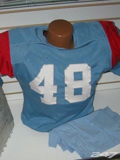
Holy cow! Those remind me of the old Houston Oilers unis.At day's end, I think I can support almost anything the men wear -- so long as we absolutely, positively NEVER go back to Phil Dickens' baby blue unis.
I beg to differ. Yes they are red, all red, (red jersey white pants looks better.) there is no double white stripe on the pants, but there is on the helmet. The white pants had the double red stripes on them. White shoes and white socks ( once heard a coach say they made his players look faster) is a much better look. Imho. Oh well I will still root for them, just don't like the look.We’ve worn this same basic set for years.
The subtle candy stripes on the sleeves and pants are a nice touch...
Last edited:
I've got to admit: I liked the candy-striped sleeve on the football uni.
Similar threads
- Replies
- 9
- Views
- 694
- Replies
- 83
- Views
- 4K
- Replies
- 1
- Views
- 573
- Replies
- 17
- Views
- 288
ADVERTISEMENT
Latest posts
-

-
If Woodson does fail next year and I hope, he doesn't...
- Latest: CriticArisen
-
-

ADVERTISEMENT